Navigation
Autocorrelation
Box Plots
Home
Links
Matlab Code
Node Ranking
Probability distribution
Simulation Reports
Time Series
Visualization
 

Time Series

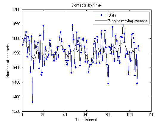
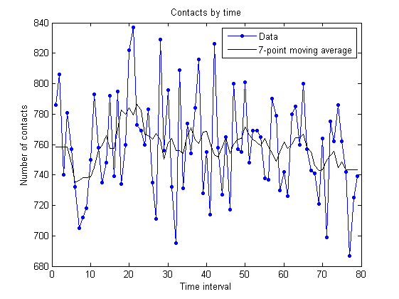
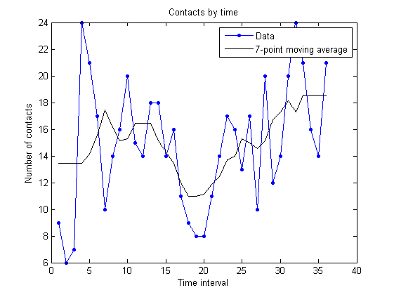
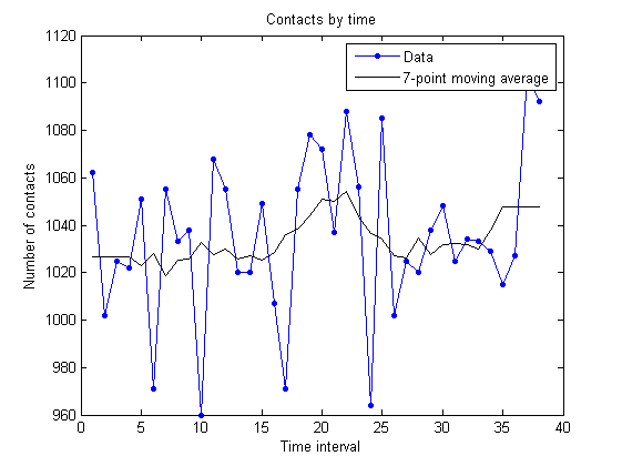
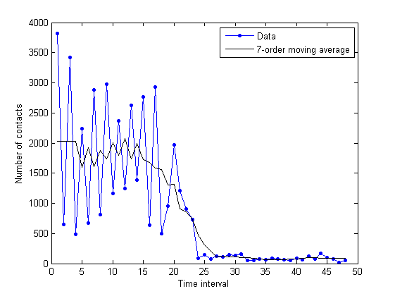
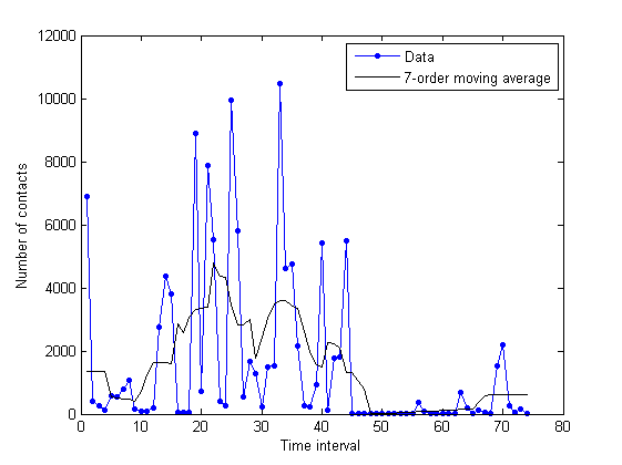
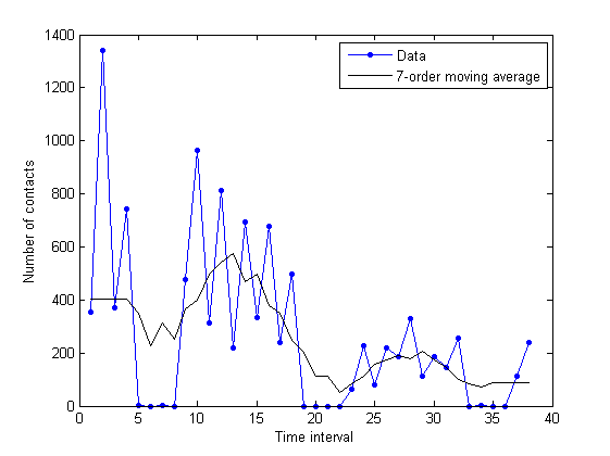
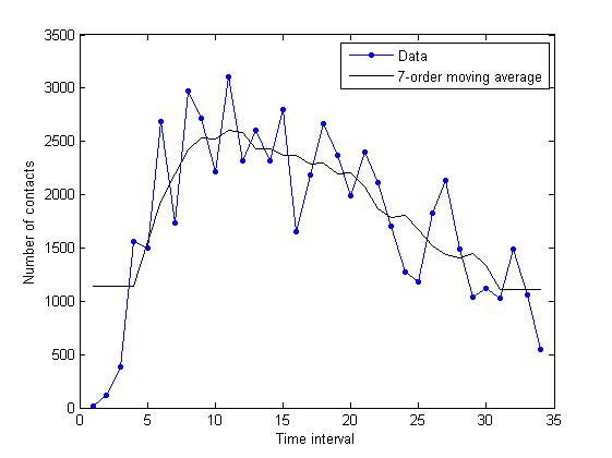
Here, the times series plots for the total duration of each dataset are presented.

The x-axis indicates the time interval, and the y-axis denotes the number of contacts.

A simple moving average technique was used to smooth the data.


unimi/pmtr:

unimi/pmtr simulation:


upmc/rollernet:

upmc/rollernet simulation:


st_andrews/sassy:

st_andrews/sassy simulation:


upmc/content:

upmc/content simulation:


Updated on Jun 1, 2012 by Pedro Vieira (Version 4)


Attachments (8)

upmc_timeseries.png - on Jun 1, 2012 by Pedro Vieira (Version 1)

sassy_timeseries.png - on Jun 1, 2012 by Pedro Vieira (Version 1)

rollernet_timeseries.png - on Jun 1, 2012 by Pedro Vieira (Version 1)

pmtr_timeseries.png - on Jun 1, 2012 by Pedro Vieira (Version 1)

upmc_content_external_ma_43200.png - on Mai 28, 2012 by Pedro Vieira (Version 1)

sassy_ma_86400.png - on Mai 28, 2012 by Pedro Vieira (Version 2)

pmtr_ma_43200.png - on Mai 28, 2012 by Pedro Vieira (Version 1)

rollernet_ma_300.png - on Mai 28, 2012 by Pedro Vieira (Version 1)