Navigation
Autocorrelation
Box Plots
Home
Links
Matlab Code
Node Ranking
Probability distribution
Simulation Reports
Time Series
Visualization
 

Node Degree

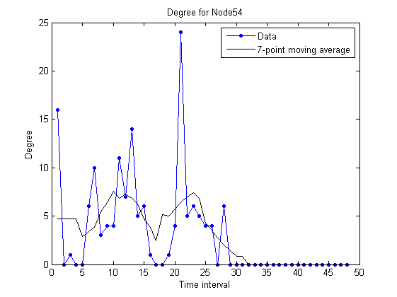
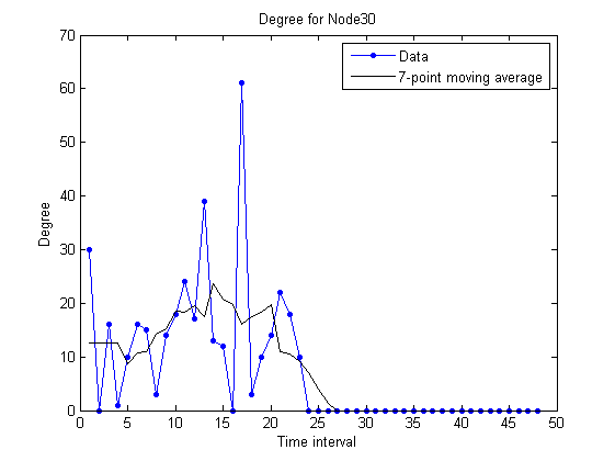
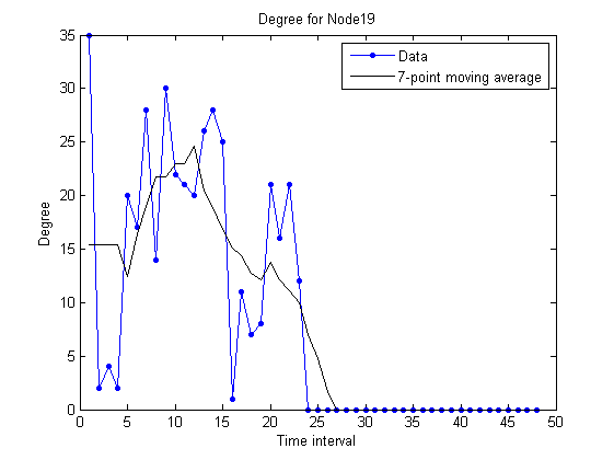
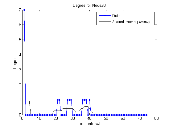
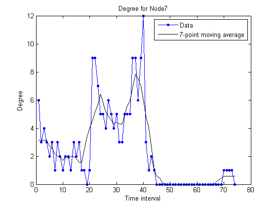
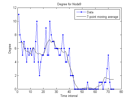
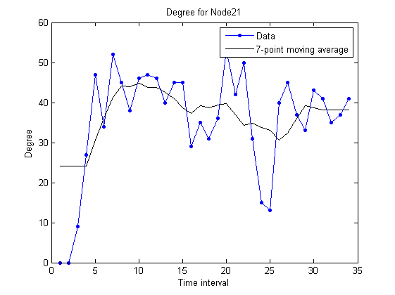
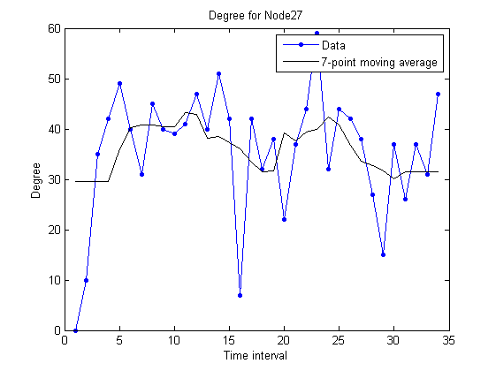
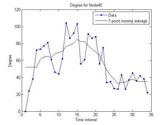
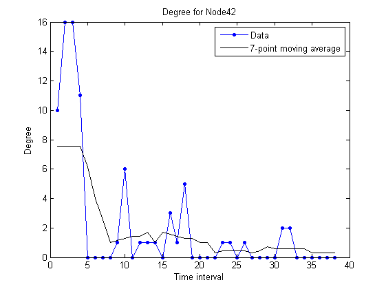
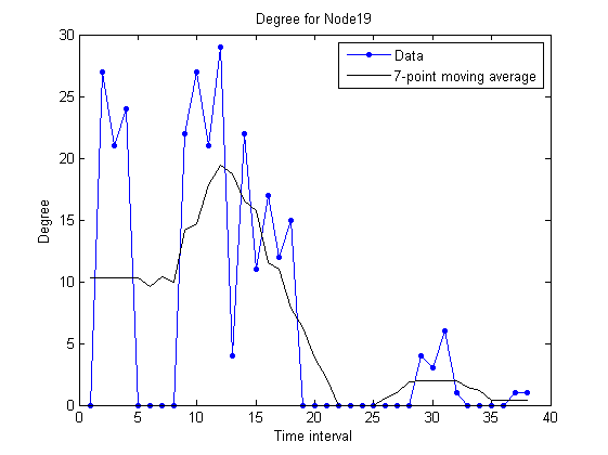
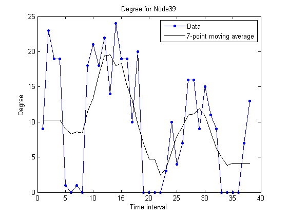
The plots shown below represent the number of different participants contacted over time, for individual nodes.

3 different nodes were chosen for each dataset, with high, medium and low number of contacts, respectively.


unimi/pmtr:


upmc/rollernet:


st_andrews/sassy:


upmc/content:


Updated on Mai 29, 2012 by Pedro Vieira (Version 2)


Attachments (12)

upmc_low.png - on Mai 29, 2012 by Pedro Vieira (Version 1)

upmc_med.png - on Mai 29, 2012 by Pedro Vieira (Version 1)

upmc_high.png - on Mai 29, 2012 by Pedro Vieira (Version 1)

sassy_low.png - on Mai 29, 2012 by Pedro Vieira (Version 1)

sassy_med.png - on Mai 29, 2012 by Pedro Vieira (Version 1)

sassy_high.png - on Mai 29, 2012 by Pedro Vieira (Version 1)

rollernet_low.png - on Mai 29, 2012 by Pedro Vieira (Version 1)

rollernet_med.png - on Mai 29, 2012 by Pedro Vieira (Version 1)

rollernet_high.png - on Mai 29, 2012 by Pedro Vieira (Version 1)

pmtr_low.png - on Mai 29, 2012 by Pedro Vieira (Version 1)

pmtr_med.png - on Mai 29, 2012 by Pedro Vieira (Version 1)

pmtr_high.png - on Mai 29, 2012 by Pedro Vieira (Version 1)