|
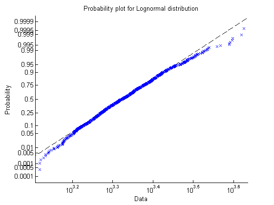
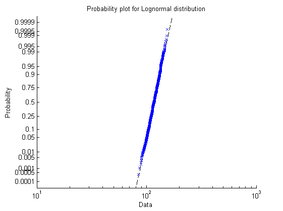
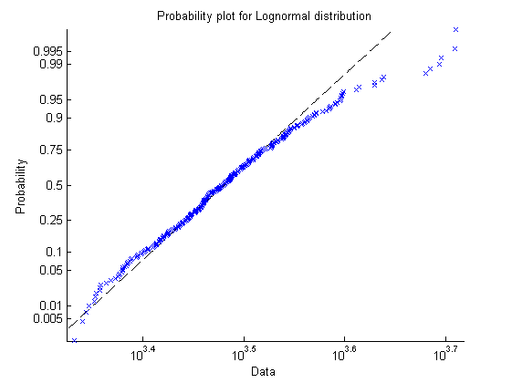
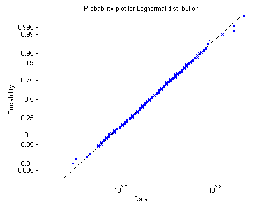
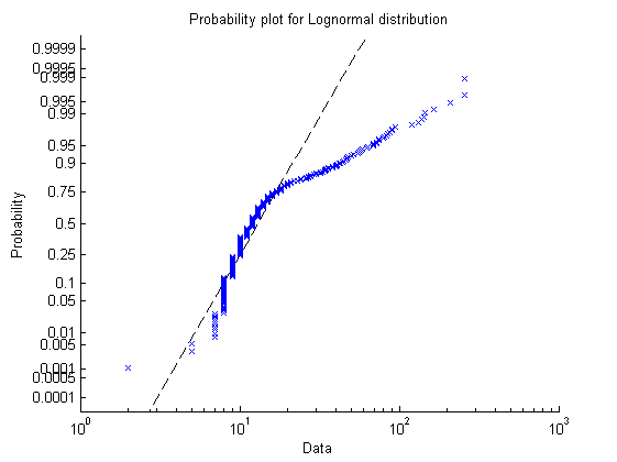
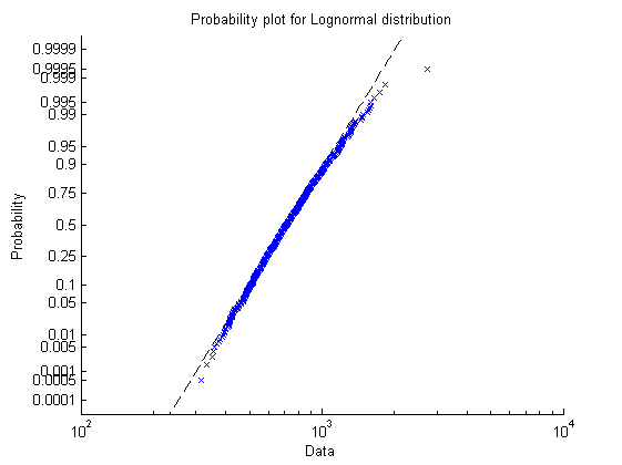
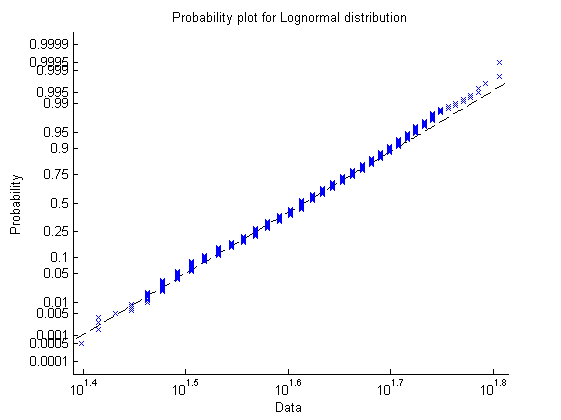
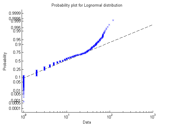
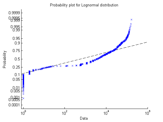
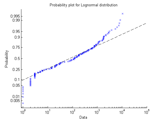
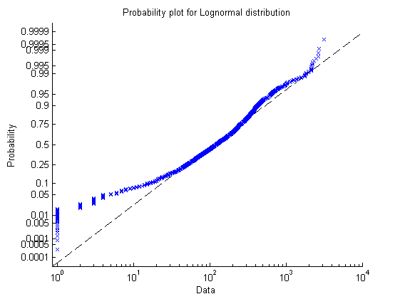
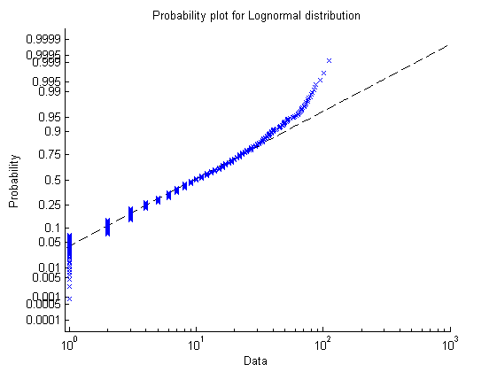
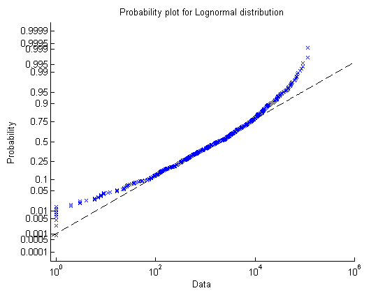
Here we present the probability distribution plots
for the contact traces.
The lognormal distribution seems to best fit the data in question. These plots compare the actual values (in blue) to the lognormal distribution (in black), for the number of contacts and contact duration, respectively. unimi/pmtr:   unimi/pmtr simulation:   upmc/rollernet:   upmc/rollernet simulation:   st_andrews/sassy:   st_andrews/sassy simulation:   upmc/content:   upmc/content simulation:   |