Navigation
Autocorrelation
Box Plots
Home
Links
Matlab Code
Node Ranking
Probability distribution
Simulation Reports
Time Series
Visualization
 

Box Plots

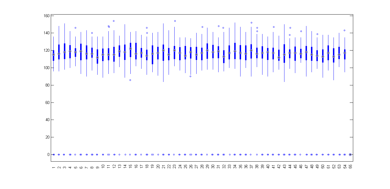
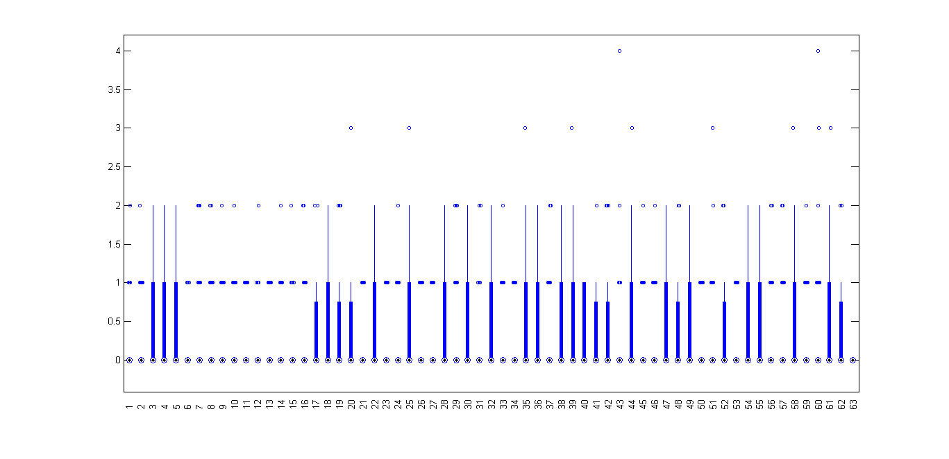
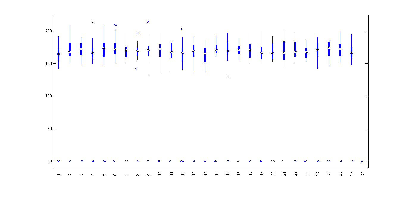
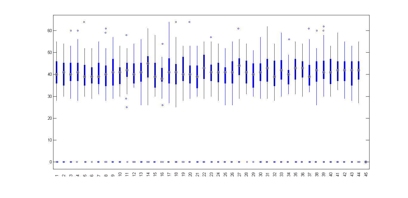
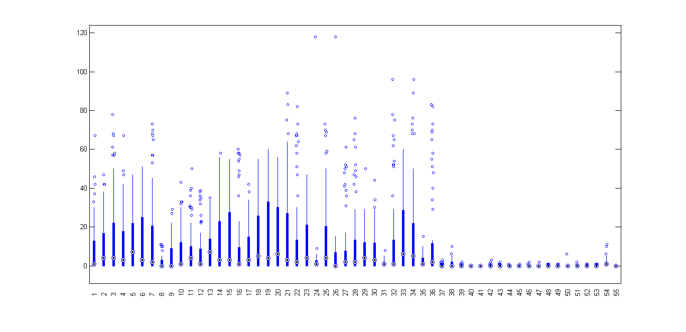
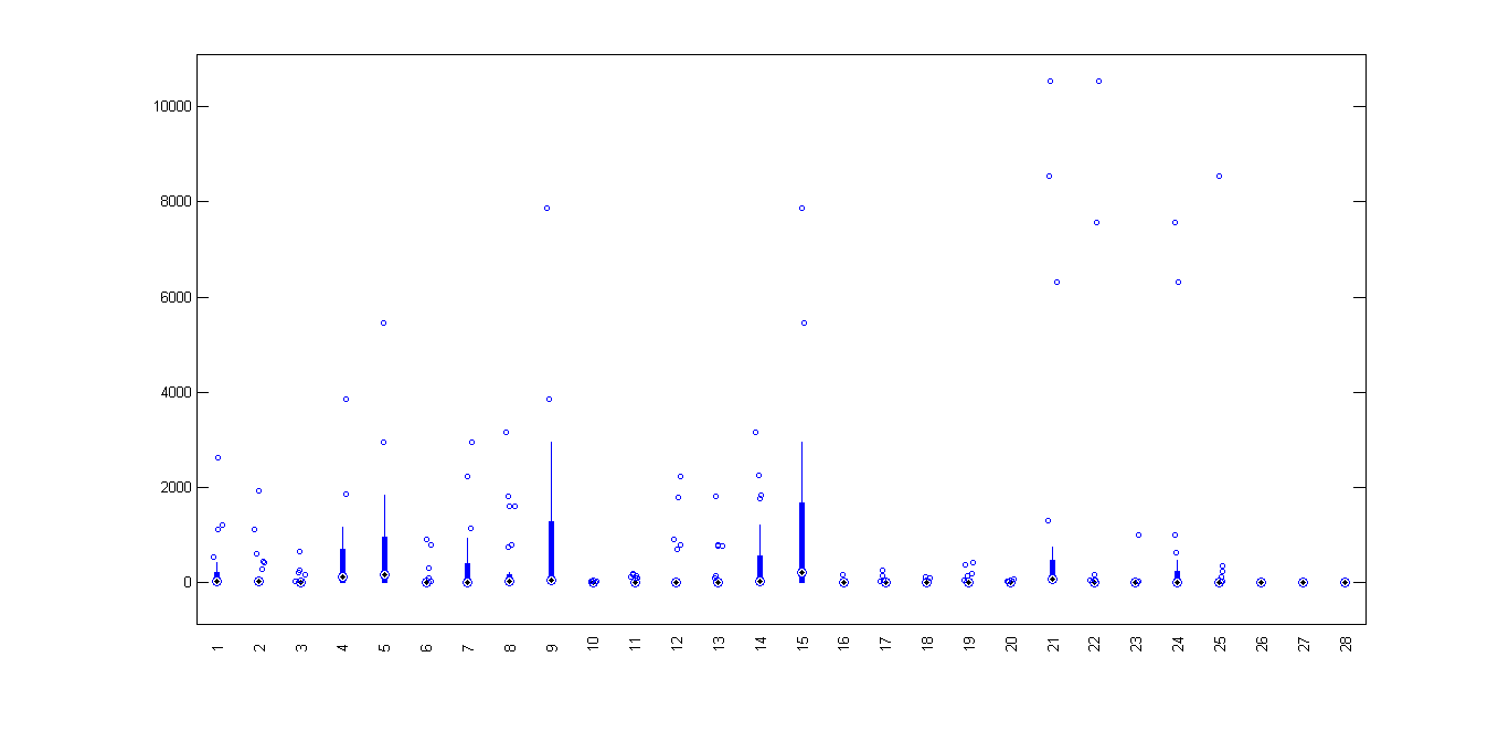
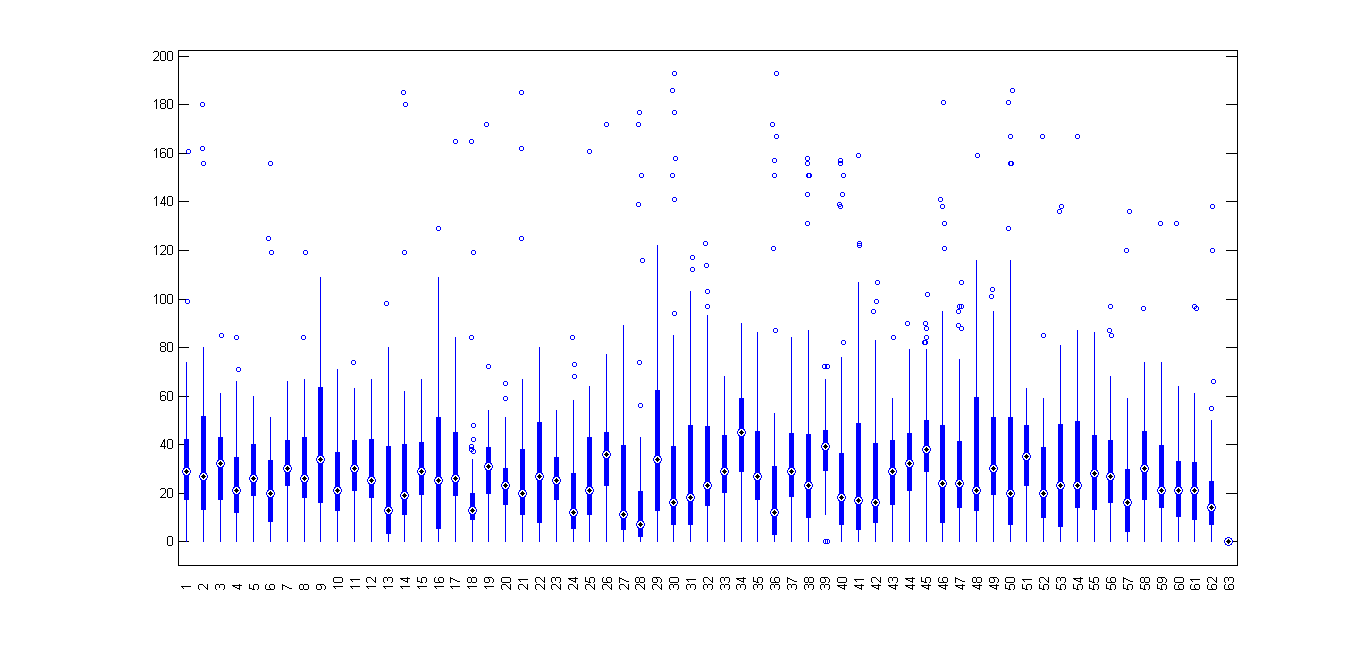
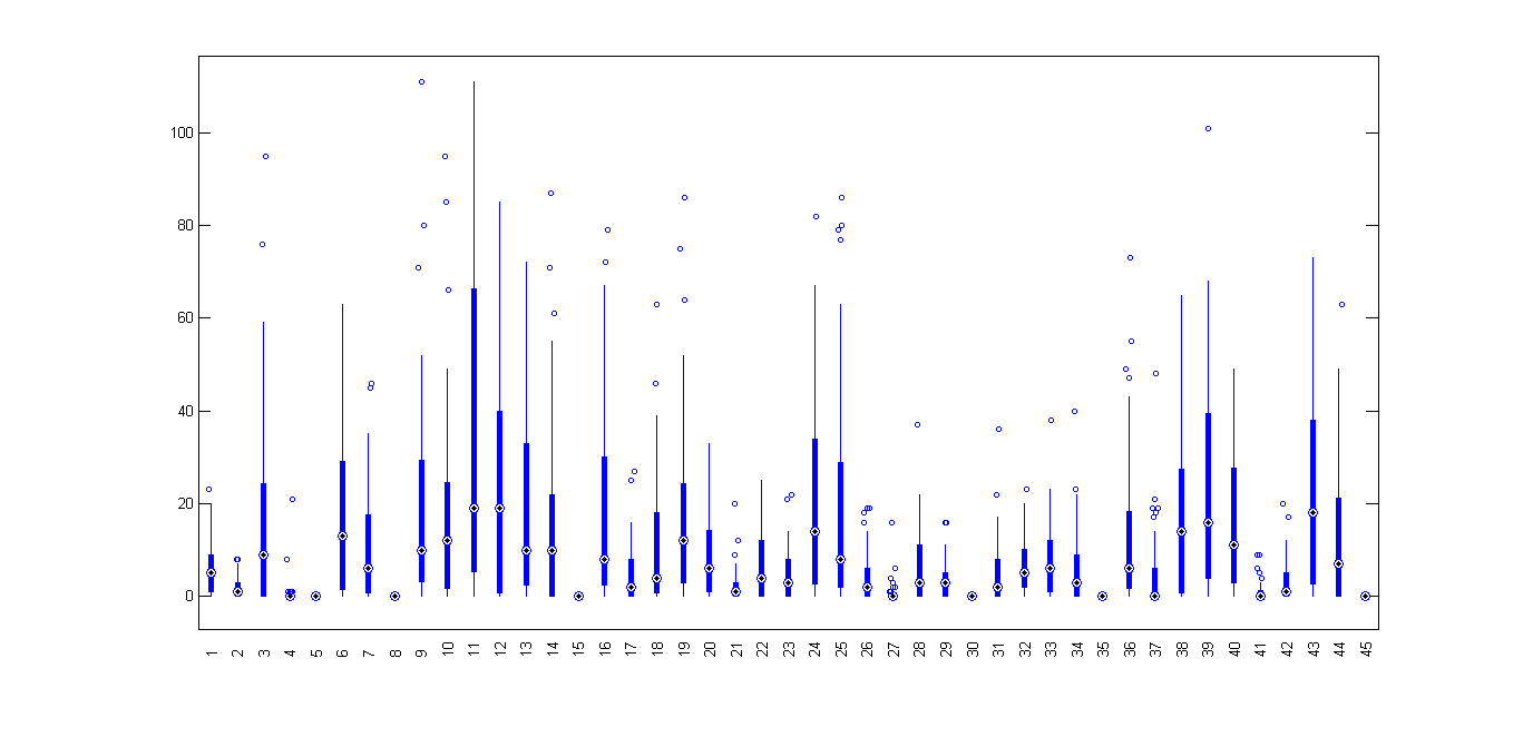
This page displays boxplots for the all of the nodes in each dataset.

Each box denotes the distribution of contacts for an individual node summarizing the following statistics:
the height of the box ranges from the 25 to the 75th percentiles, the center marker denotes the median,
and the whiskers indicate the range of values that aren’t considered outliers.

The data outliers are marked individually, above the boxes.


unimi/pmtr:


unimi/pmtr simulation:


upmc/rollernet:

upmc/rollernet simulation:


st_andrews/sassy:


st_andrews/sassy simulation:


upmc/content:

upmc/content simulation:


Updated on Jun 1, 2012 by Pedro Vieira (Version 6)


Attachments (8)

upmc_boxplot.png - on Jun 1, 2012 by Pedro Vieira (Version 1)

rollernet_boxplot.png - on Jun 1, 2012 by Pedro Vieira (Version 1)

sassy_boxplot.png - on Jun 1, 2012 by Pedro Vieira (Version 1)

pmtr_boxplot.png - on Jun 1, 2012 by Pedro Vieira (Version 1)

upmc_content.png - on Mai 28, 2012 by Pedro Vieira (Version 1)

sassy.png - on Mai 28, 2012 by Pedro Vieira (Version 1)

rollernet.png - on Mai 28, 2012 by Pedro Vieira (Version 1)

pmtr.png - on Mai 28, 2012 by Pedro Vieira (Version 1)